Alert buttons
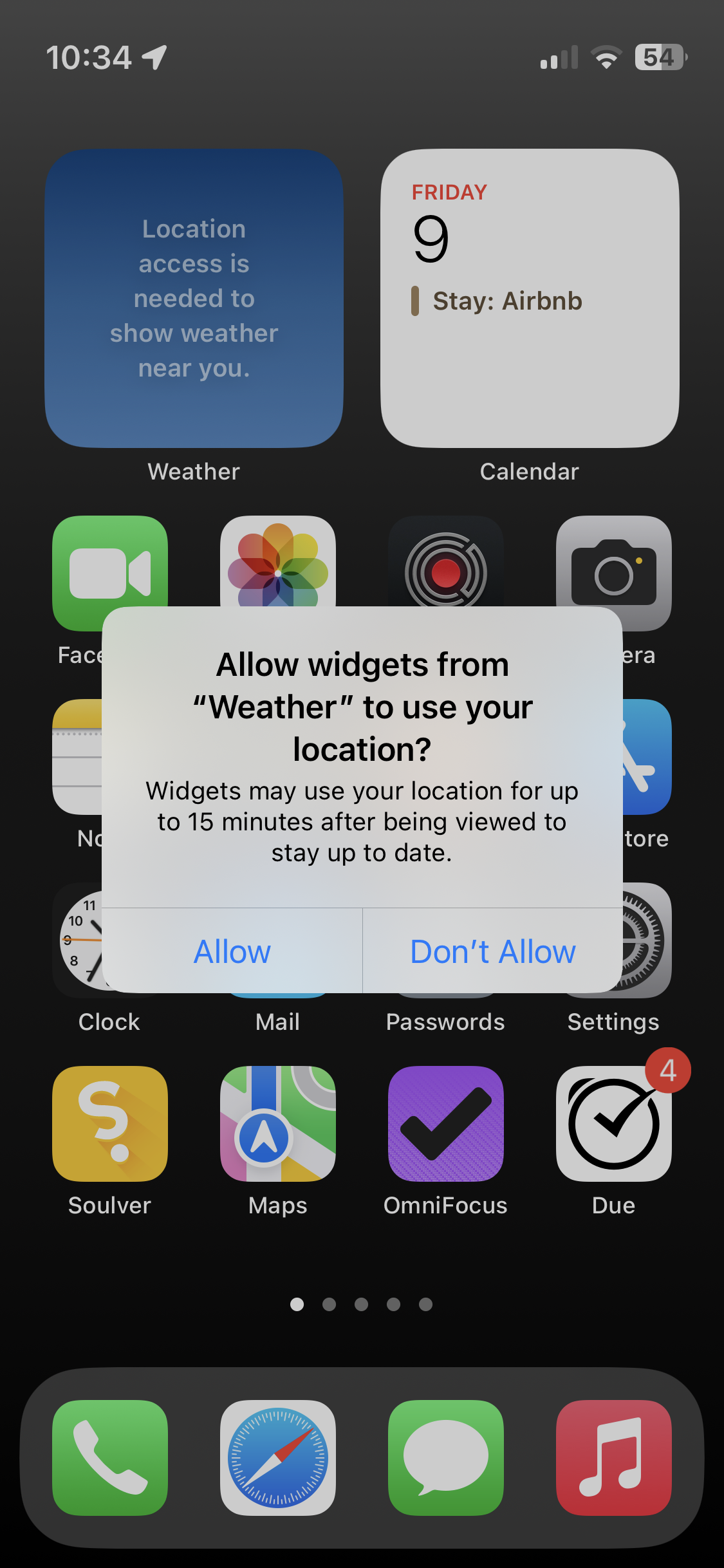
Example of iOS alert not following the HIG. Traditionally in OS X, later iOS and macOS, the cancel button is on the left and the okay button is on the right.


I think it may be a intended purpose, if your reflexes always hit the OK button, this is maybe a case where it could be smart to not allow access. I’m not saying that it is optimal.

Not sure I agree. The HIG says the "button people are most likely to choose," or the "default button," should be on the trailing side, so this could just suggest they consider "Don't Allow" to be the more likely choice. "Don't Allow" is perhaps closer to "cancel" than "allow," but neither is equivalent to a cancel button.